
Florida Blue Reporting Framework
Tools: Adobe XD, Illustrator, Miro
Role: Lead UX Designer, Visual UI Designer
Responsibilities: Usability testing, User interviews, Facilitating ideation sessions, Prototyping & Wire framing, Visual & Interaction Design, Design System
Prototype
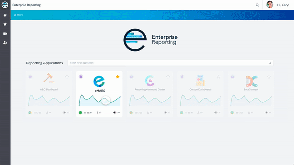
The Enterprise Reporting Framework is an internal tool and suite of applications to help employees create, track, and request custom reports based on daily, weekly, and monthly data.
Below is a video prototype that was used for stakeholder alignment.
The Problem
Currently enterprise reporting is a collection of applications used across the enterprise to access reports and company metrics. eMARS is the primary internal reporting application that allows users to search for and view customized reporting and metrics.
Diving in
To get started, I conducted introductory interviews and a task analysis to understand the user’s pain points and how they used the reporting applications.
Business Users need to find relevant reports quickly so they can use the data to create status updates and inform their business decisions.
Pain Points:
Report details are hard to find
Finding an existing report is time consuming
There is no set process for requesting and accessing custom reports
How might we design an application that allows employees to find, access, and request custom reports and company metrics quickly and efficiently?
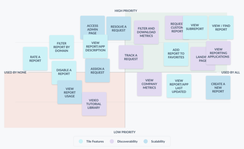
Importance Matrix
I lead an ideation workshop to create an importance matrix to understand what features the users valued most. This also helped to prioritize which features to develop for the first release.
Goal:
Redesign the reporting application and create a way to manage, and resolve requests for custom reporting so business owners can do their jobs more efficiently and quickly.
Efficient Navigation
How can users navigate to existing reports quickly ?

Consistent Process for Custom Reports
How can users request and access custom reports efficiently?


Enhance Discoverability of Report Details
How can users easily find specific report details?
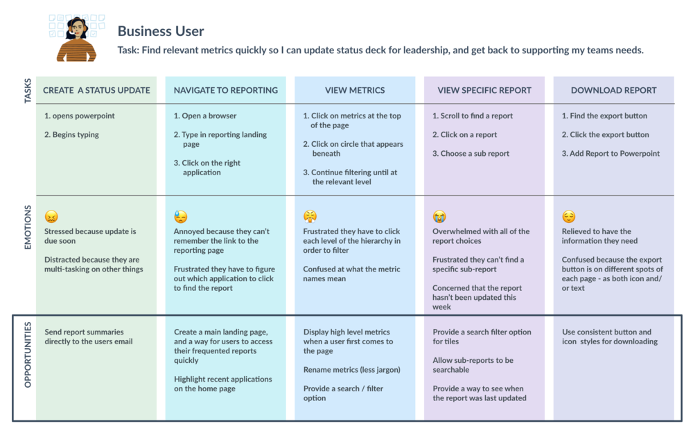
User Journey
To empathize with our users, I created a user journey map based on user feedback. This allowed me to empathize with the users pain points, and begin brainstorming possible solutions.
Task flow
Once the key features and pages were defined, I organized the users key tasks into a task flow.
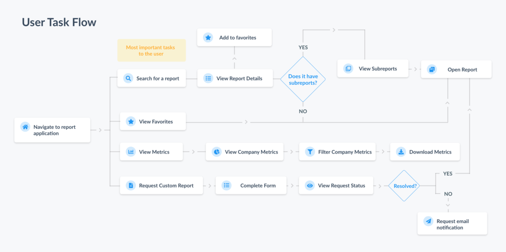
PROBLEM 1:
How can users find specific report information quickly and easily?
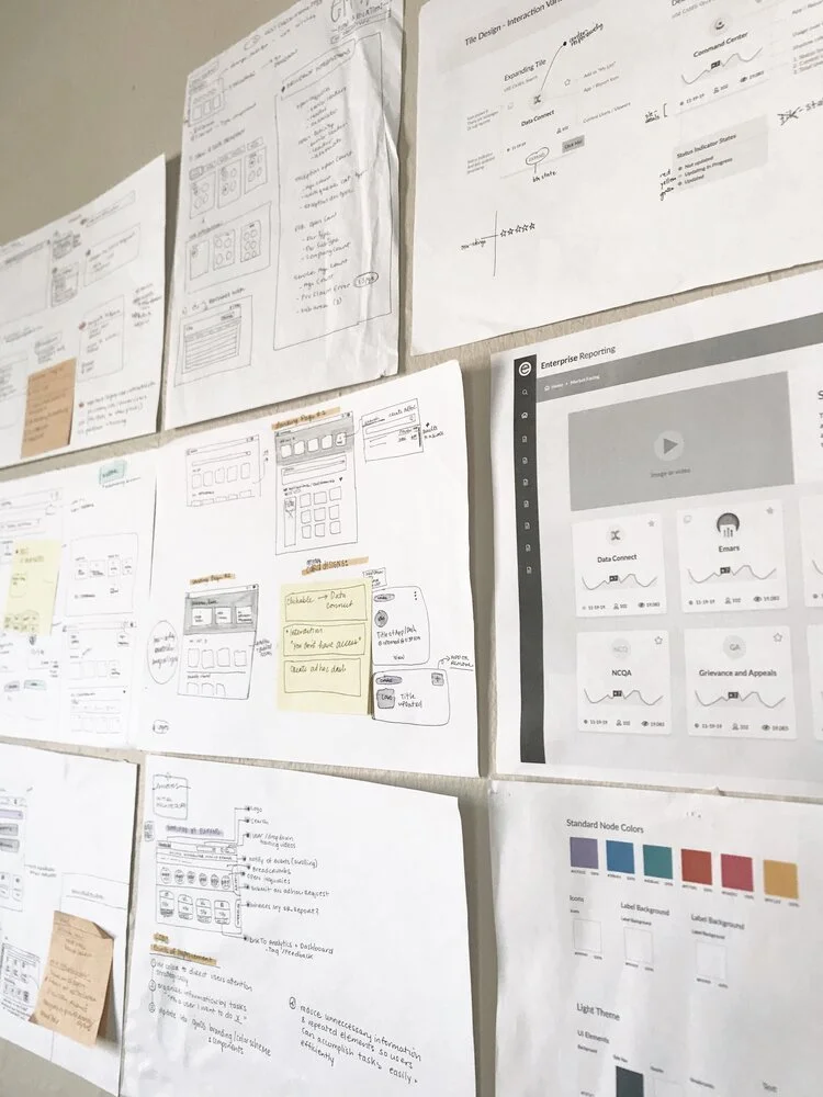
Ideation
I facilitated a 45 minute white board session to think of ways we might redesign the report tiles to optimize for quick browsing, and efficient searching.
Key Takeaways
Stick with card component (called report tile), and redesign for optimal report discoverability based on search context.
Create a way for users to bookmark reports for quick browsing and access.
Provide report details on the front of each tile
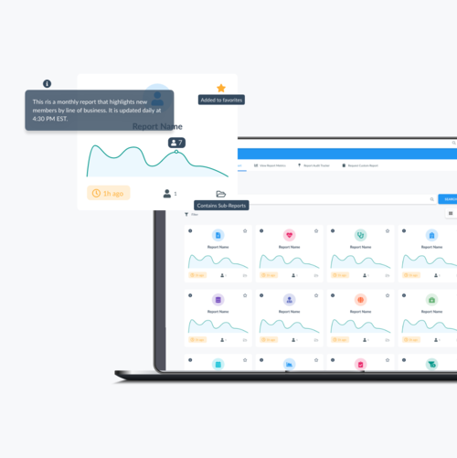
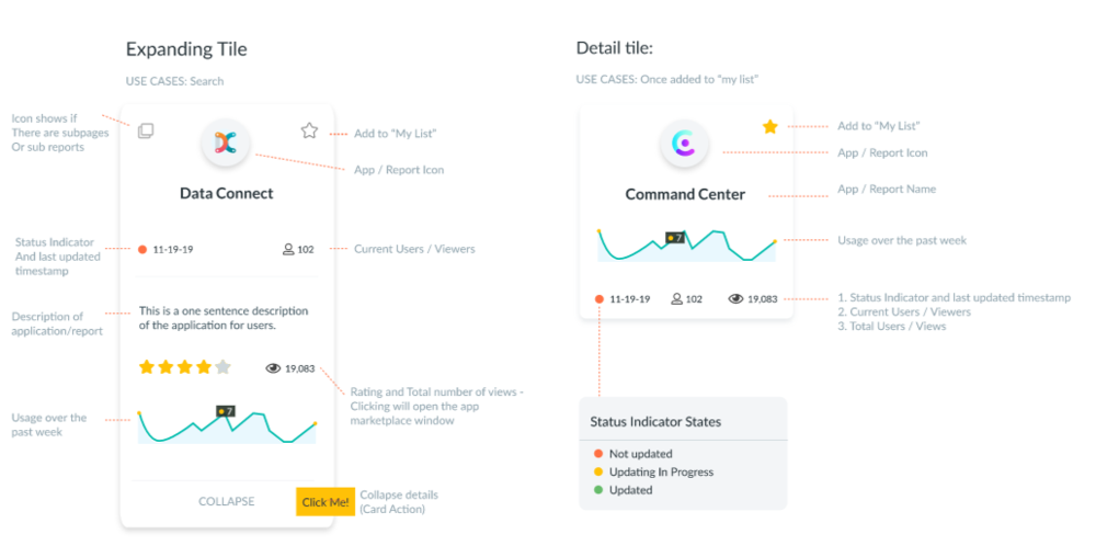
Initial Tile Design
Initially, we decided to create 2 tile types based on whether a user was searching (and needed more information) or whether the tile was already added to a person’s favorites.
Design Revision
Next, I conducted a moderated usability study, followed by a digital survey on 3 business users and 2 developers.
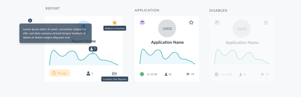
Defining Tile States
Most users didn’t engage with the expanding tile or find the additional information useful, so the final design focused on report vs. application tiles.
There might be instances where a user didn’t have access to a report, or a developer disabled it in order to troubleshoot.
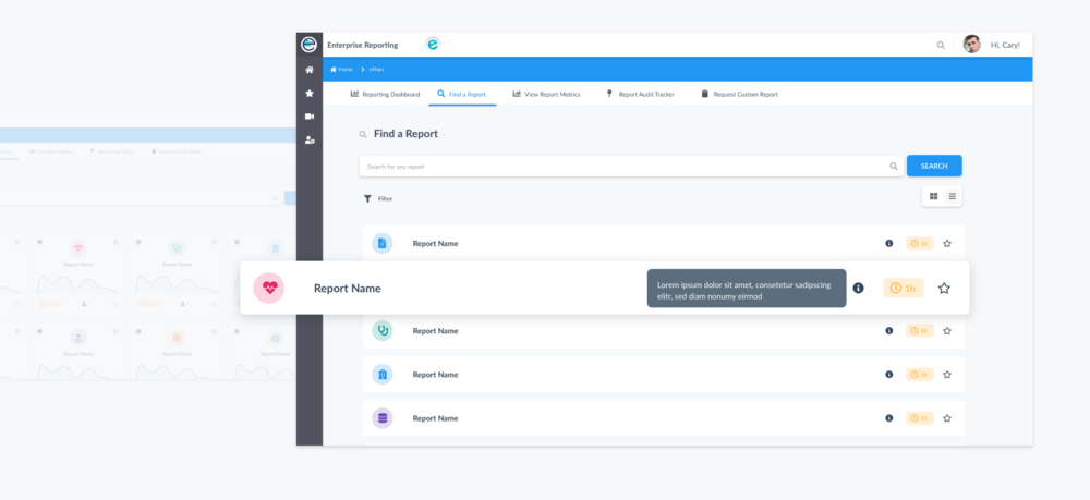
Scannable List View
I also added a toggle that shows an alternate view of the reports in a list to allow easy scanning. This will be especially useful when a user is browsing more 10+ reports. Listing the tiles allows users to maintain vertical flow.
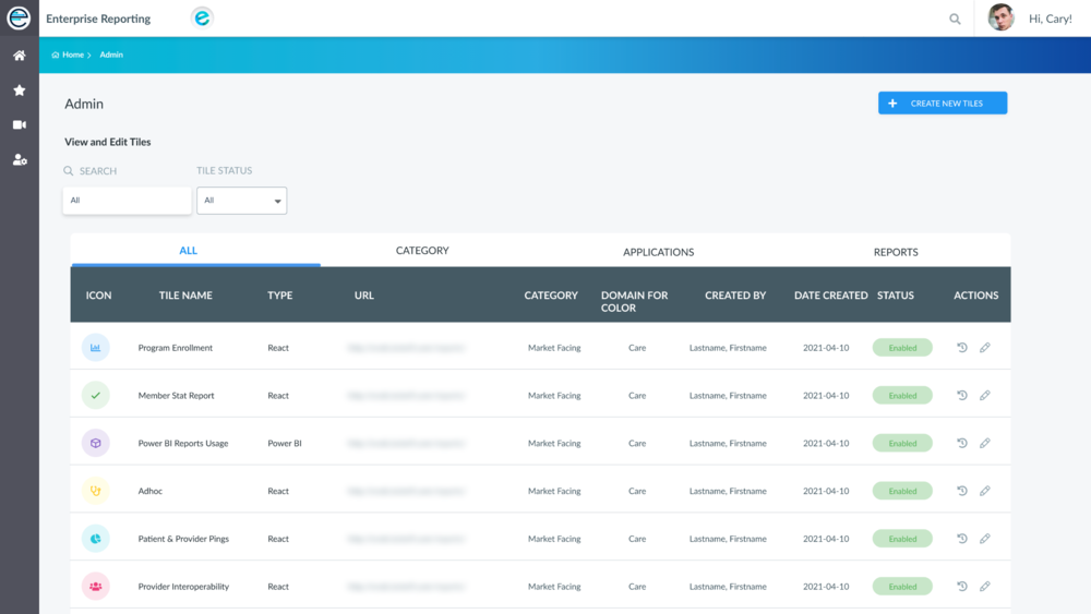
Supporting Report tile creation from the front end
Applying color meaningfully — I also created a color system that would allow developers to create tiles that used color in a meaningful and consistent way.
Flexible Searching, filtering, and browsing
Users are able to search all reports, and navigate to nested reports when applicable. For easy scanning, a toggle switch is available that changes the view from a grid to a list.
Outcome
After tracking the usage of the application after one month, the redesign had the following impact:
Increased report usage by 114% (with an average of 60 weekly views per report)
Reduced emails to the team by 92% (from 63 a month to 5 per month)
Team Handled 74 tickets (with 69 resolved successfully within SLA)
Take Aways
This was the first project that I got to take the design lead on and I learned so much working on an internal product that hundreds of users across the business. Along the way I learned a few valuable lessons:
An Ideal UX Process
Working with developers in the ideation phase proved to be invaluable. They were able to quickly offer insight and recommendations. It also allowed us to build a level of trust and open communication which helped when translating the specs into code.
Stakeholders have different goals than the user
There were a few times where the stakeholder wanted to add features and elements that weren’t aligned with the user goals. In this case it was my responsibility as a designer to make sure their needs were heard, and to also advocate for the user by looping back to our initial goals established.