
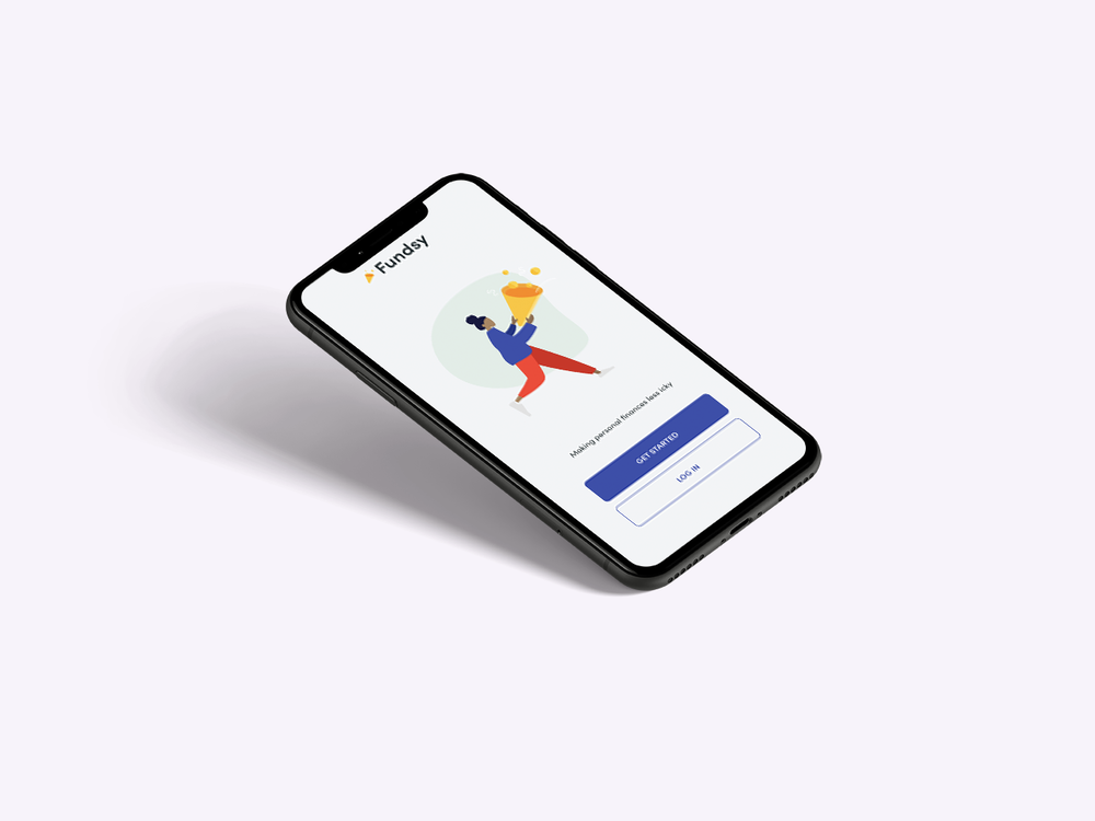
Fundsy is a concept design for a financial wellness product aimed to help adults track and manage their funds collaboratively.
Tools: Adobe XD, Miro, Illustrator
Role: UX Designer & VIsual Designer
Responsibilities: Research, Wireframing, Persona Creation, Interaction Design, Visual Design, Prototyping, and Usability Testing
Kick off
Young adults need a way to track multiple accounts in one place so they can understand their full financial health.
The Challenge:
Many young adults 18-29 have different accounts for cash, student loans, and credit cards. Each account may have a different application which makes it harder to get a full picture on overall financial well being. Due to powerful concepts like compound interest, getting a full picture of financial well-being, and exploring financial options as early as possible is essential.
Competitive Analysis
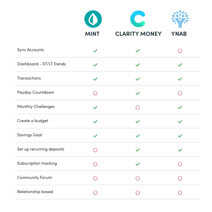
In order to fully understand the product space, I spent time exploring products users currently use. I evaluated 3 of the most popular applications in the apple store to evaluate several features that Fundsy could build upon, and to explore any potential gaps in the market.
None of the applications have a community forum
2 out of 3 applications didn’t include a payday countdown
All applications allowed for users to create savings goals, however most goals were generic and not customizable.
All of the applications used blue or green brand colors and had simple, professional feeling interfaces reminiscent of banking apps.
Research Questionnaire
I conducted a questionnaire to understand how users approached their personal finances, and if convenience was more important or depth.

Painpoints
Based on the research and user interviews I conducted, I chose to focus the initial design on the following pain points:

There aren’t any applications that allow users to leverage the power of communities and peer knowledge.

Young adults need a single source of truth for their financial needs that display all accounts in an aggregate view.

Banking can be stressful and most banking applications feel impersonal and professional.

Users want a flexible way to customize their goals and spending to their unique personal goals.
How might we create a collaborative and fun way for young adults to gain insight into their financial health so they can make proactive and informed decisions about their future?
Solution
Create an application that allows a user to see their spending, income, and debts across all accounts in one view. Empower users to create personal goals, and leverage community to create less anxiety around finances in an easy and enjoyable way.
Friendly
Easy to use
Collaborative
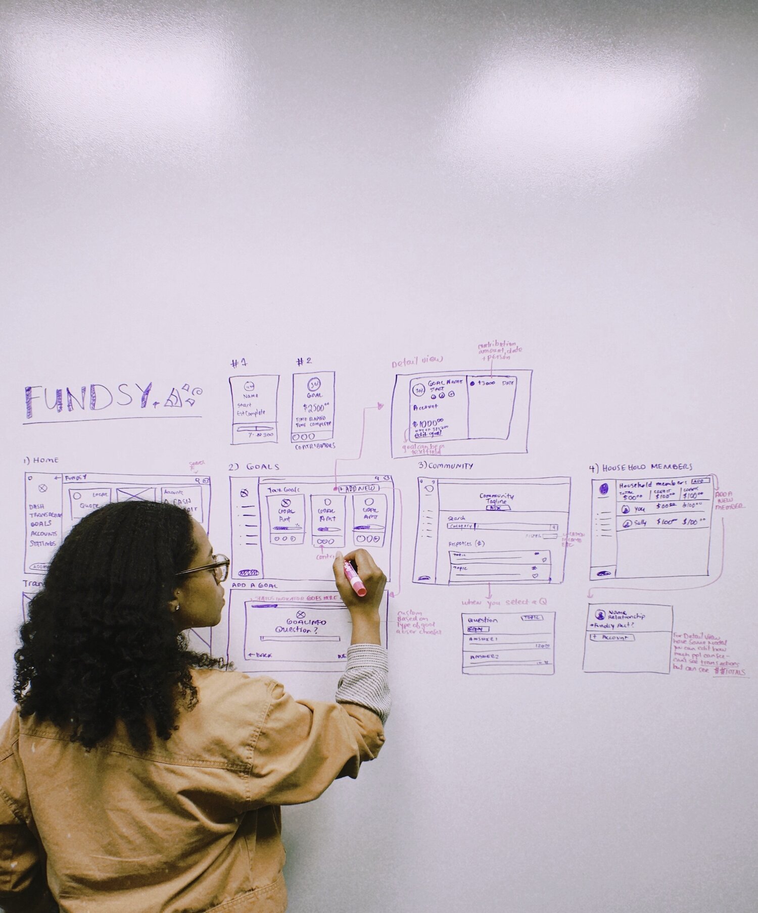
Ideation
I chose to do a collaborative white board session with 3 other people. By allowing each person to offer ideas, and then immediately sketch them out, we were able to see which ones were feasible. We were also able to get a better idea of the information architecture at a high level by seeing all of the screens side by side.
Key Takeaways:
Add household members — Users may want to add their spouse or household members to their accounts
Reduce cognitive load — Elevate the interface by using visual representations and a dashboard view instead of numbers when appropriate so it doesn’t appear text heavy.
Sharing vs. Privacy — Explore what information users are comfortable sharing in the community forum (real photos vs. icons, income level etc)
Usability Testing
I reviewed the low fidelity prototype with 5 participants in order to understand which interaction patterns were most usable and desirable. Each participant was given a task to review your accounts, create a new goal, and review and upvote an item on the community board.
Takeaways
“I rarely use my computer for banking”
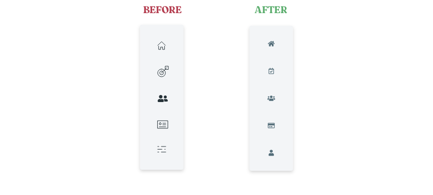
The biggest take away however, was that 4 out of 6 of my users mentioned they would prefer that the application was mobile friendly since they rarely use their computers for banking.
This feedback in combination with the fact that most millenials already do banking on their phone (Source), lead me to revise the design entirely into a mobile first approach.
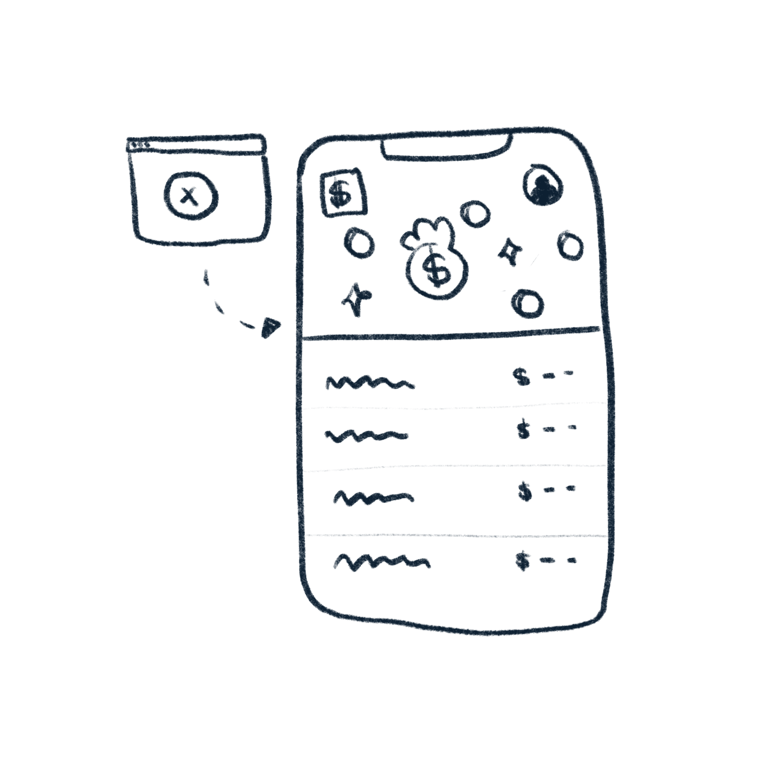
Clarify Iconography - Users were unsure what the icons meant. I decided to change the iconography and also add text descriptions (where applicable) so users would know immediately what they’re clicking on.
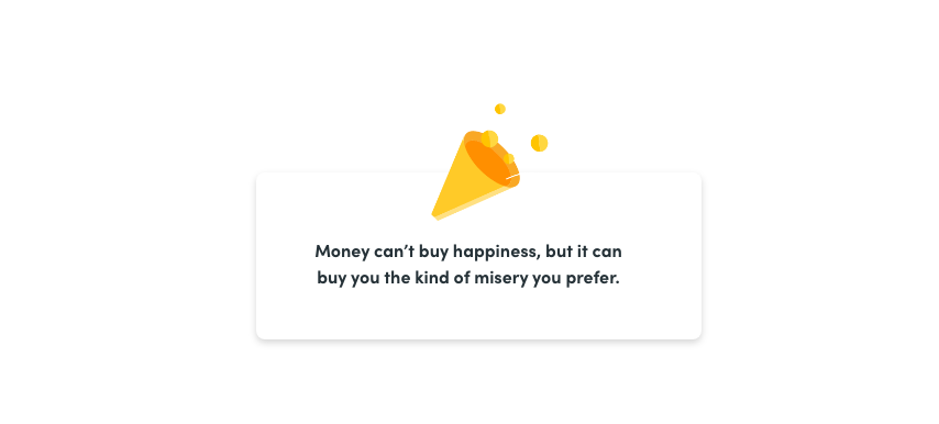
Add humor & inspiration - I decided to add quotes, or funny blurbs to the dashboard to make it feel less like a bank dashboard. Millenials want to hear about things they're passionate about (Source), so the content could also be inspired by their recent spending habits.
Add contrast & apply color meaningfully - To create more differentiation between sections, I decided to add colored backgrounds to the content cards. In all cases where a user has a surplus of money, the color green will be applied. If there is a negative amount, the default font color will be used (red has a stressful connotation and might discourage, or stress some users.)
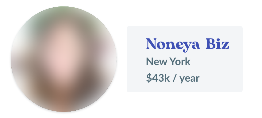
Sharing Personal Information — Understandably, users were not comfortable sharing their real photographs, or names. However most users (4 out of 6) were comfortable with sharing their location, annual income, and a screen name of their choosing.
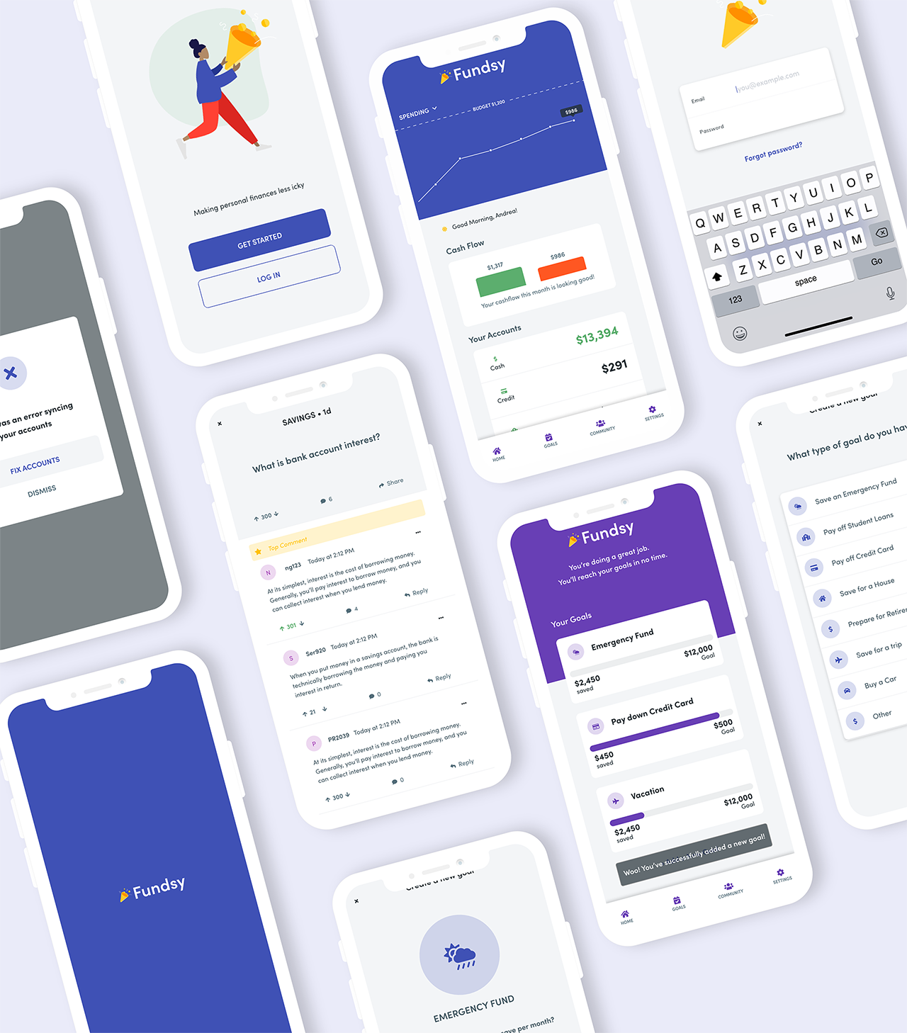
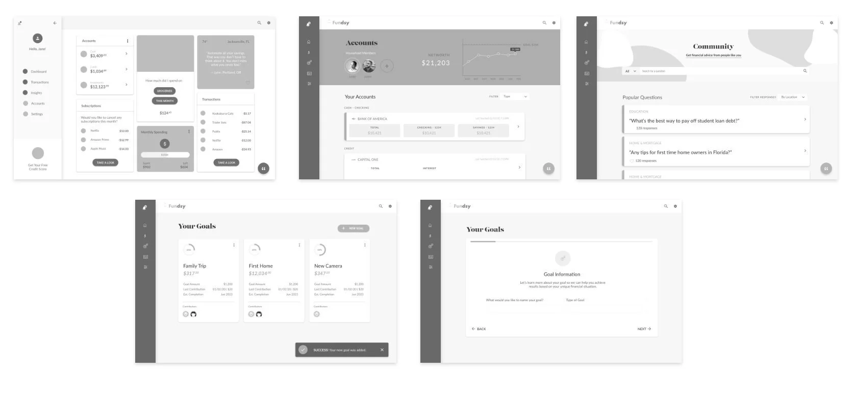
Final Prototype
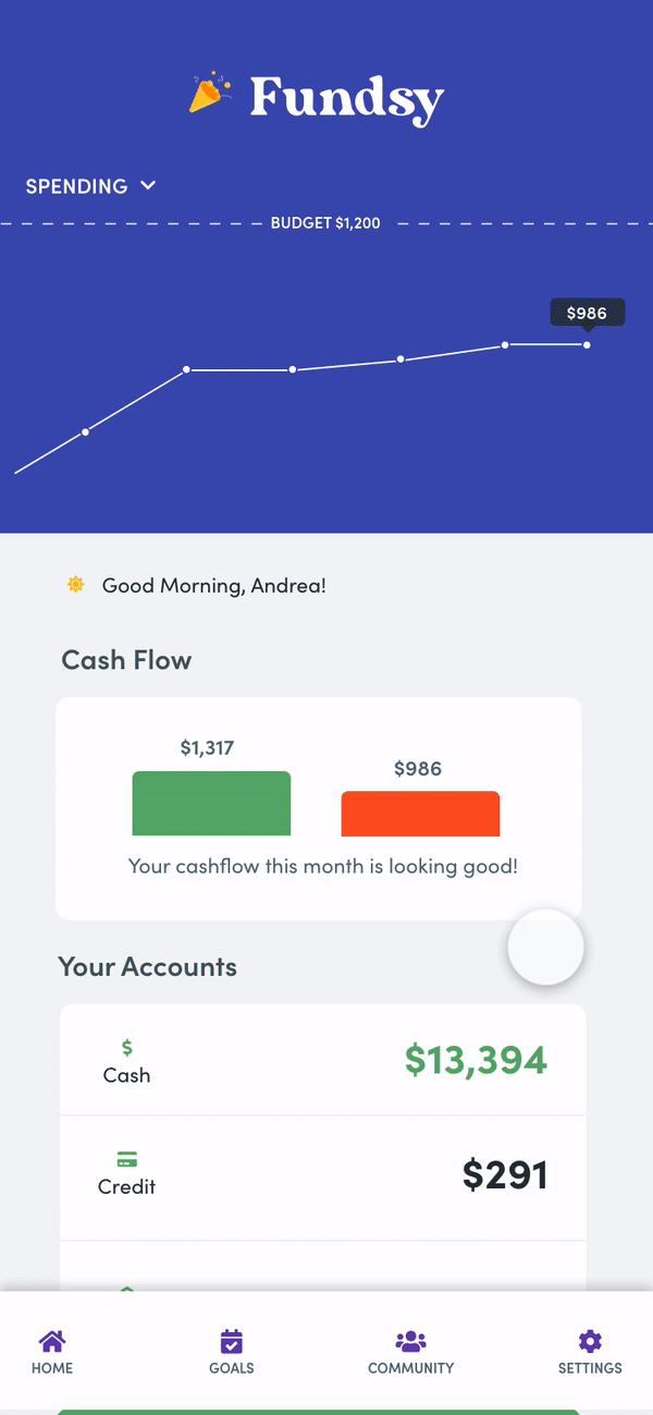
Dashboard / Transaction View:
Users have insight into all their spending transactions, and also trends. This allows them to keep an eye on their spending, income, and overall financial habits. Transactions can be filtered by date, and also by category (deposit, transfer, withdrawal). Additionally by clicking on a transaction, a user is able to add a #Hashtag to help organize and identify their transactions.
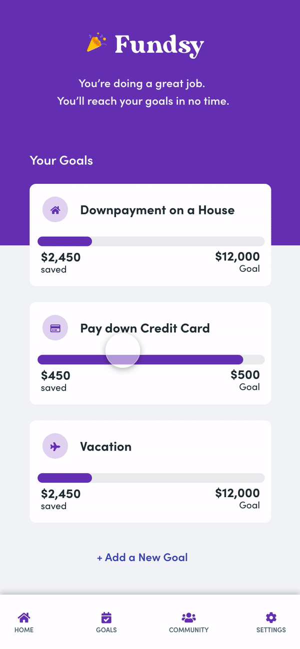
Goal Setting:
Users can set financial goals based around their lifestyle. Fundsy will then offer unique cards on the main dashboard and tips that allow users to keep track of their personal goals. The user can see both default goals, and suggested goals based on peer recommendations from similar income levels.
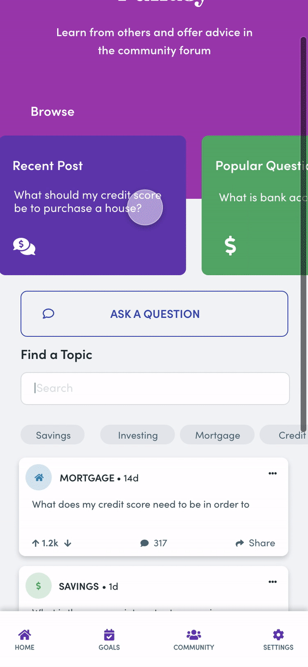
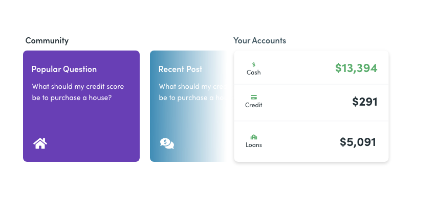
The Power of Community.
Users can ask and view common questions in a private community board. While the profile stays anonymous, users can see the income and location of people asking and answering a question. Questions can be upvoted, liked and commented, similar to services such as Quora which many people are already accustomed to.