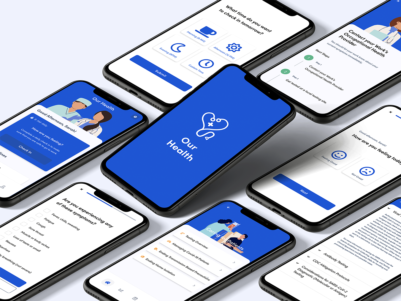
Our health is a mobile application that allows essential healthcare workers to self report and learn more about COVID-19 symptoms and CDC recommended workplace practices.
Role: UX Design, Research, Prototyping & Wireframing
Tools: Adobe XD, Figma, Illustrator, Whiteboard, Miro
This was a self initiated project focused on creating a concept for a real, urgent health care challenge. It was a two week sprint that I took from concept, to tested prototype all on my own.
A note:
In 2026, I revisited this project. I realized a mobile health communication tool for frontline healthcare workers navigating rapidly evolving workplace safety guidance is a problem that still exists today for any high-stakes, time-sensitive information environment.

Kickoff
The Challenge
During the COVID-19 pandemic, Health care workers are being routinely exposed to high risk situations. They need a convenient way to track their own exposures based on patient care, as well as a way to keep up to date with CDC recommended practices around potential exposures.
Proposed Solution
The app intends to address this issue by providing CDC recommended guidelines in an easy to consume format, and allowing users to self-report any symptoms and exposures, so hospitals can easily track the spread of the virus within health care settings.
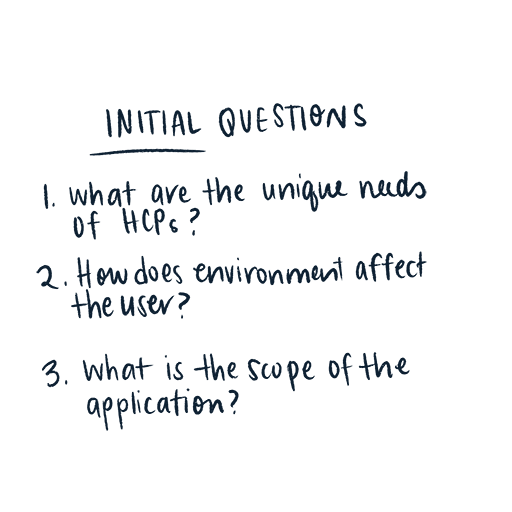
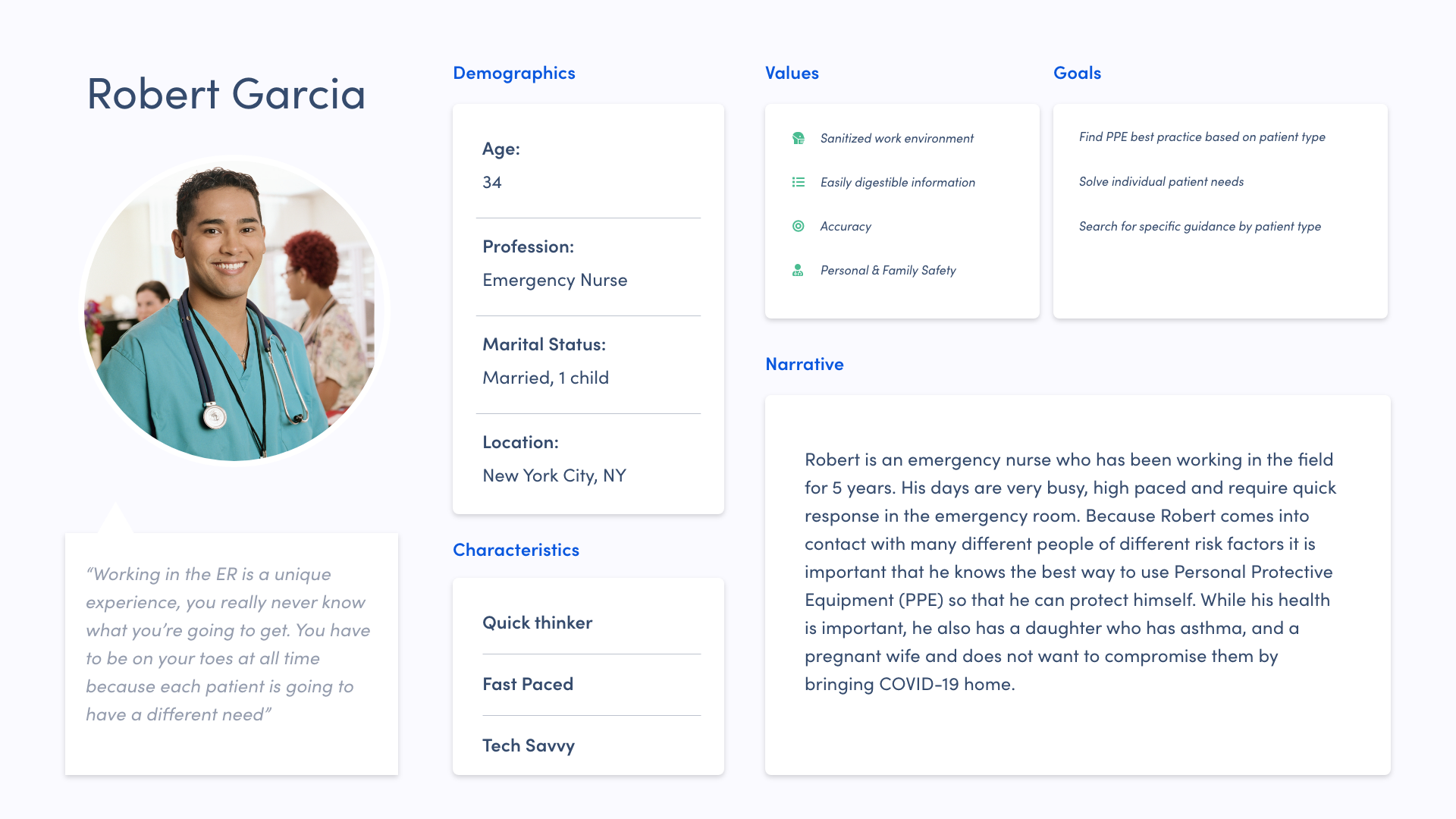
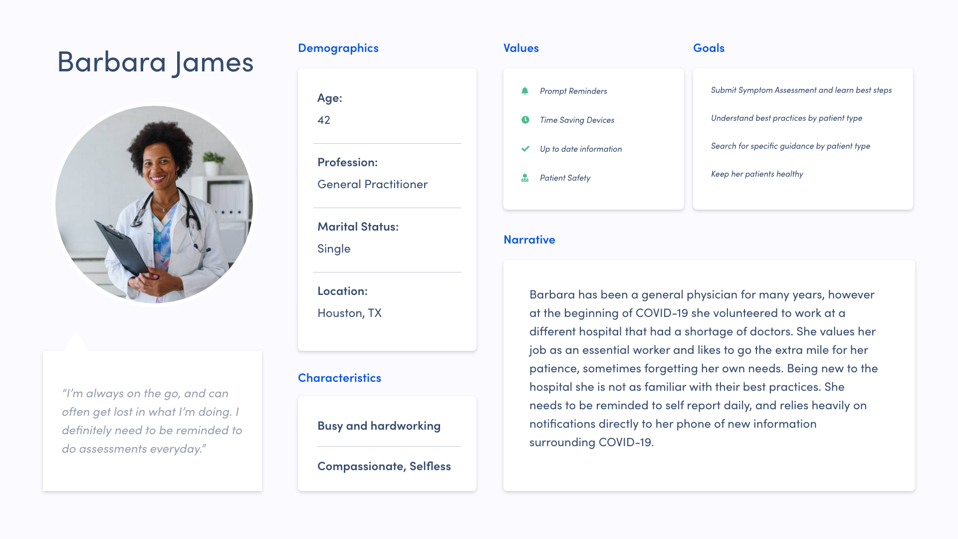
Research
HCP’s are at high risk of infection
Currently, those at greatest risk of infection are persons who have had prolonged, unprotected close contact with a patient with confirmed SARS-CoV-2 infection, regardless of whether the patient has symptoms.
Constantly Evolving Practices
There are specific guidance and work restrictions for Health Care Practitioners (HCP’s) based on patient type, exposure type and length of exposure. However, the CDC’s recommendations are constantly being updated and have evolved with the development of COVID-19.
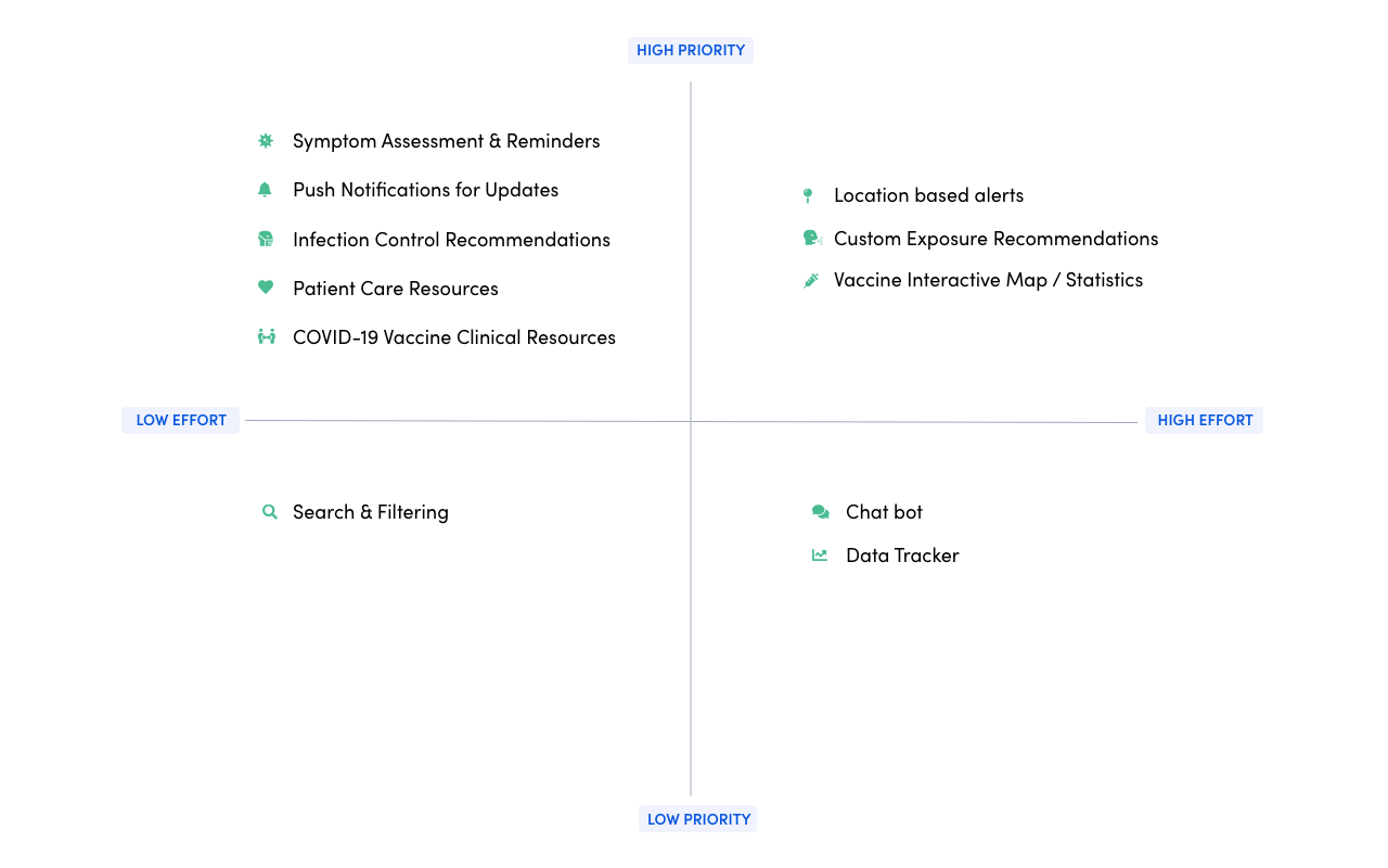
Feature Prioritization
Plotting a list of features helped to narrow down the scope of the application. Since HCP’s have a broad range of needs, mapping the features by highest priority items, and also effort in terms of creation was key.
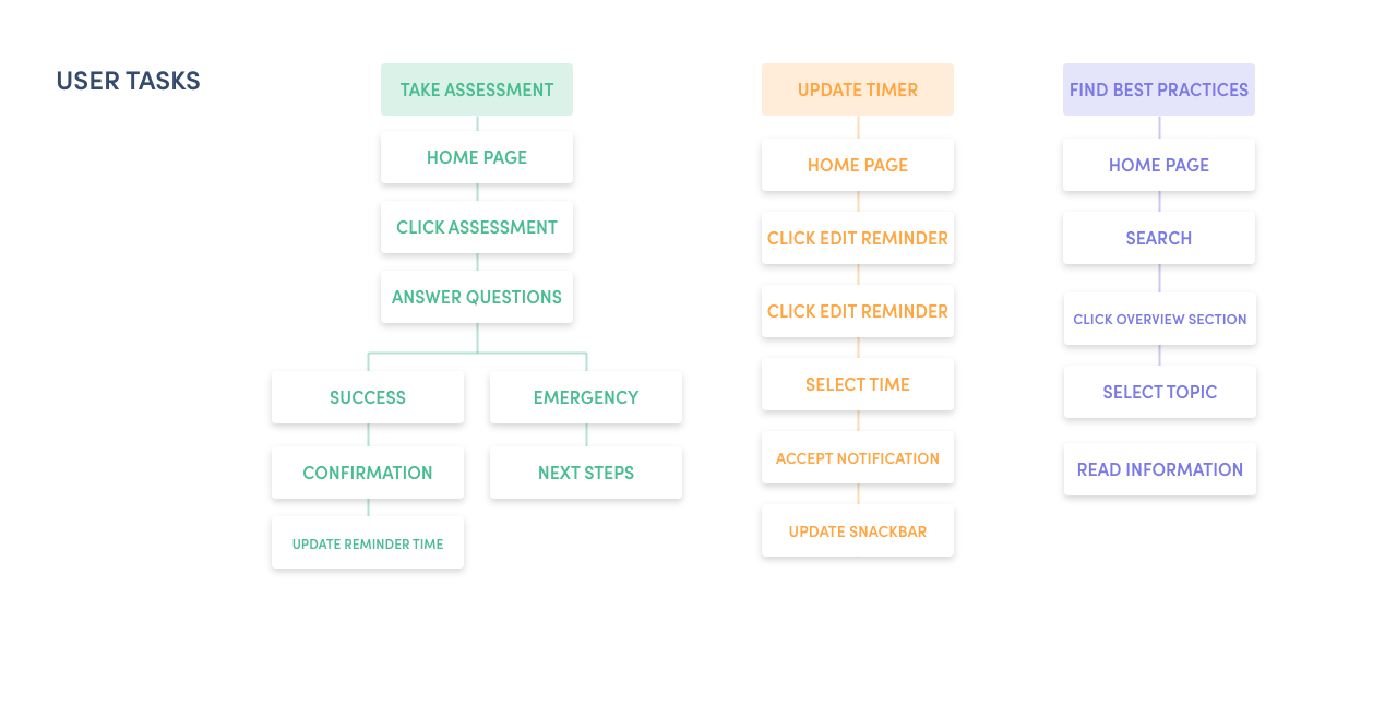
User Task Flow
I created a user task flow to better comprehend how users would access information, and to simplify the primary user experience.
This allowed me to focus primarily on the end user’s goals and their needs. It also helped me to organize the information hierarchy around pages that were across all user tasks (such as the home page, search, and reminder times)
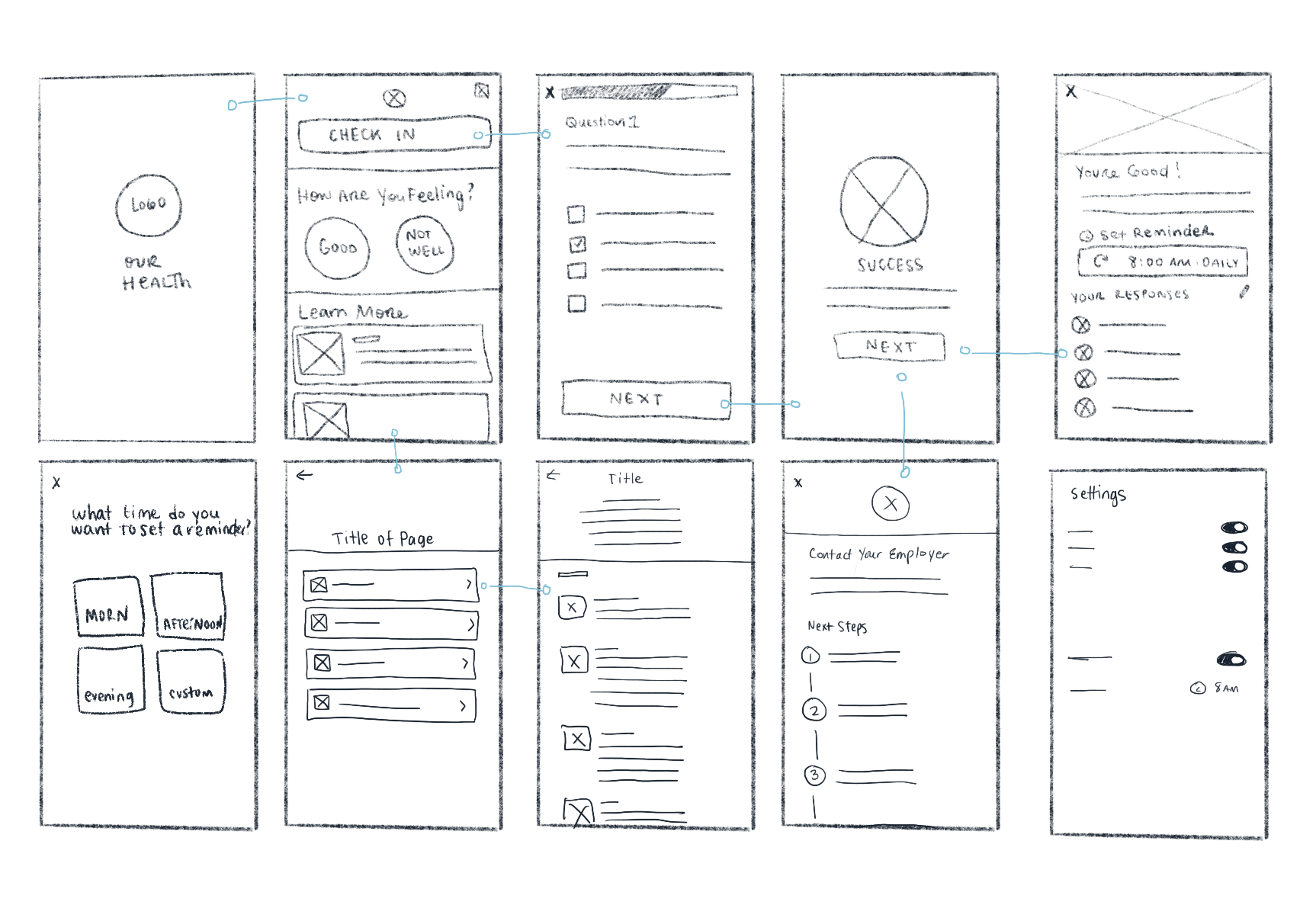
Sketches
After completing the architecture of the application, I sketched my initial thoughts of the mobile interface. This allowed me to visualize the architecture and begin thinking about interactions and experience.
Initial Wireframe
Once sketches and overall architecture were established, I began drafting the skeleton of OurHealth. Drafting out the key interactions and testing them with real users enabled me to quickly fix small issues such as touch target size, key line alignments and formatting.
Usability Test Findings:
I tested the application in a moderated usability session with 3 HCP's and one additional person with no health care background.
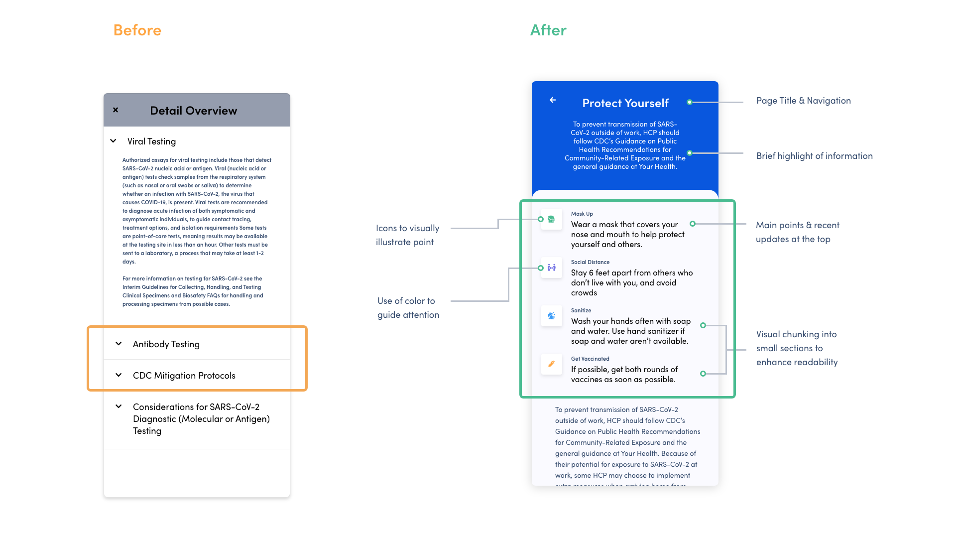
Finding important information quickly
“I would find it annoying to keep having to click into each section to view more information. “
On the detail page, 50% of users had difficulties finding information because it was hidden behind an accordion view. I also ran into similar feedback about the page being text heavy. To fix these issues, I made all the text scrollable to make scanning easier. Added a summary (TL;DR) section at the top of the page including icons to visually illustrate each bullet. Each icon is a different color to guide attention. I also included a brief summary of each article, and implemented white space to enhance readability.
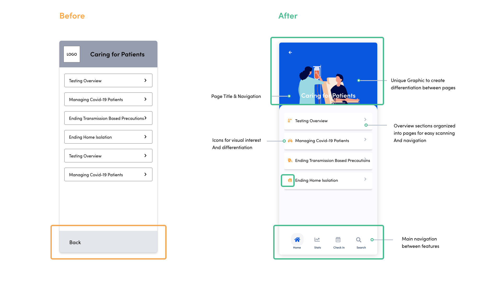
Strategically placing images and icons to create hierarchy
“It’s somewhat lackluster.”
When browsing for information users didn’t like that the pages felt text heavy. To remedy that, I added unique illustrations at the top of each page, icons to differentiate each topic from one another, and changed the navigation to icons instead of text.
Final Design
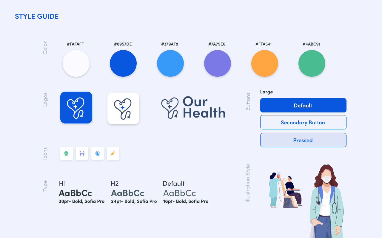
After the initial design was tested, I used feedback from testing participants to create a final design. I used color intentionally to guide the users attention and create a modern, friendly interface that felt inviting, and trustworthy.
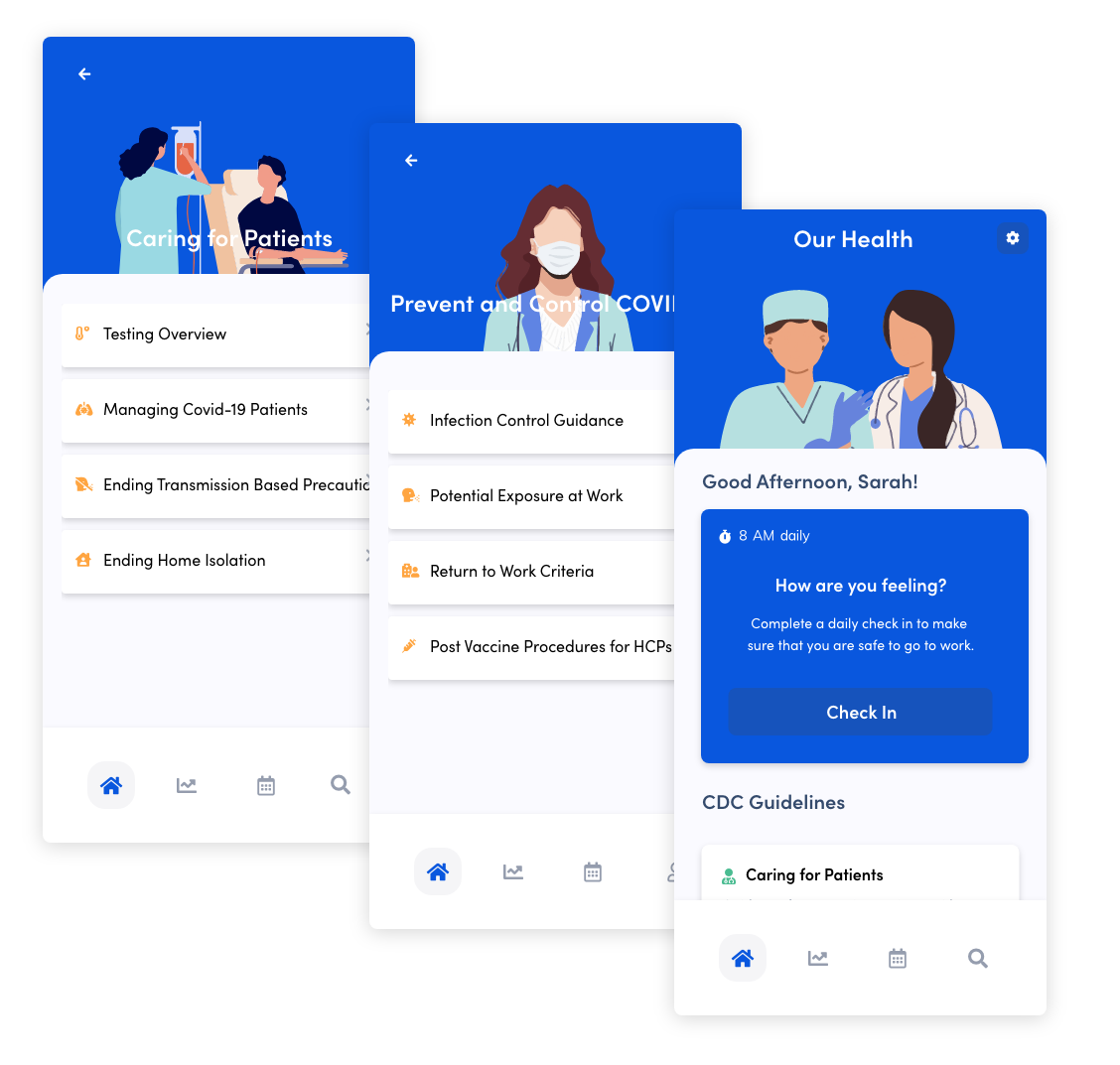
Finding Detailed Information
Finding information is easy. Users can navigate to recent CDC guidelines that are sorted by topics important to them, including Clinical Care Tips, Infection control Topics, and guidelines on how to control the spread of infections in a health care environment. They can also use the search option in the bottom navigation.
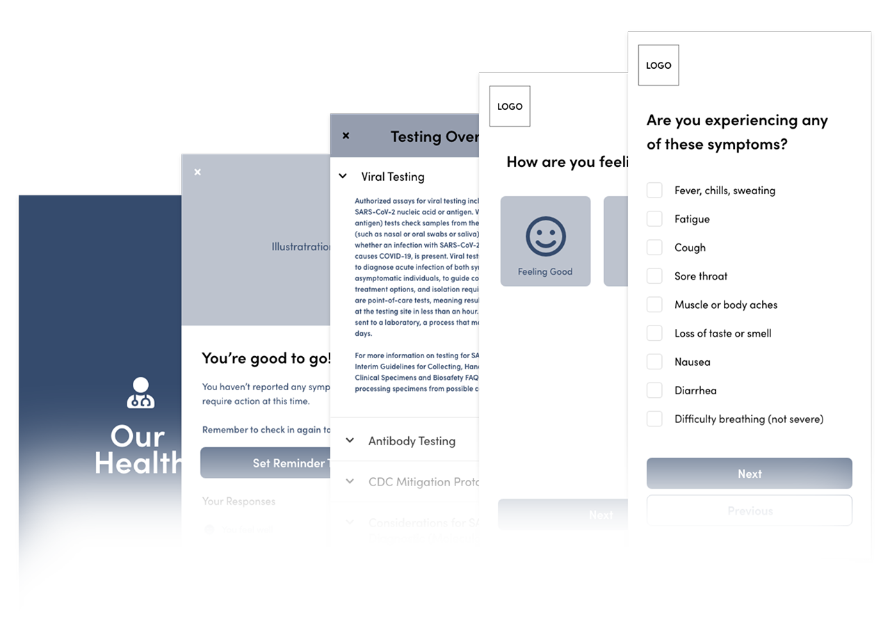
Taking the Assessment
When users select the ‘check in’ button on the home page, they are prompted with a series of questions. Once the questions are answered a success or warning page will appear. At any point a user can cancel the assessment and pick up later where they left off. A status bar at the top fo the page shows the user where they are in the assessment.
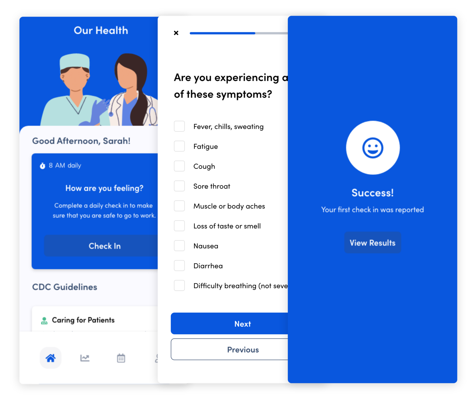
Assessment Results
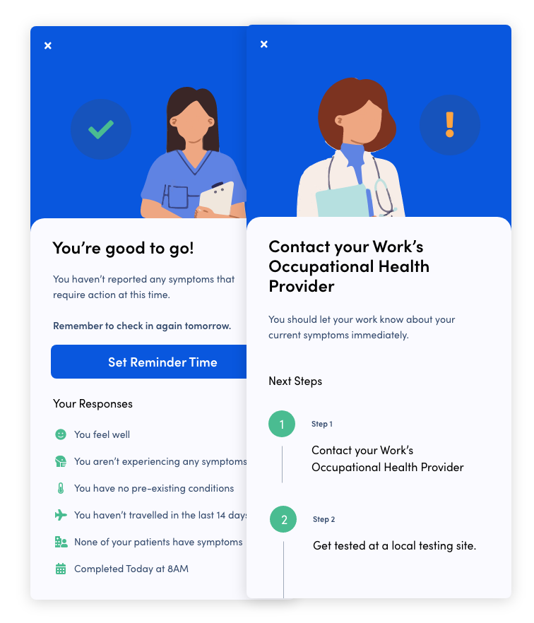
If a user hasn’t reported any symptoms, a success screen is displayed that notes their responses and allows the user to update their reminder time, or edit their responses.
In the scenario where a user has selected symptoms of importance, a warning screen is displayed and best practices about what steps to take are shown to the user.
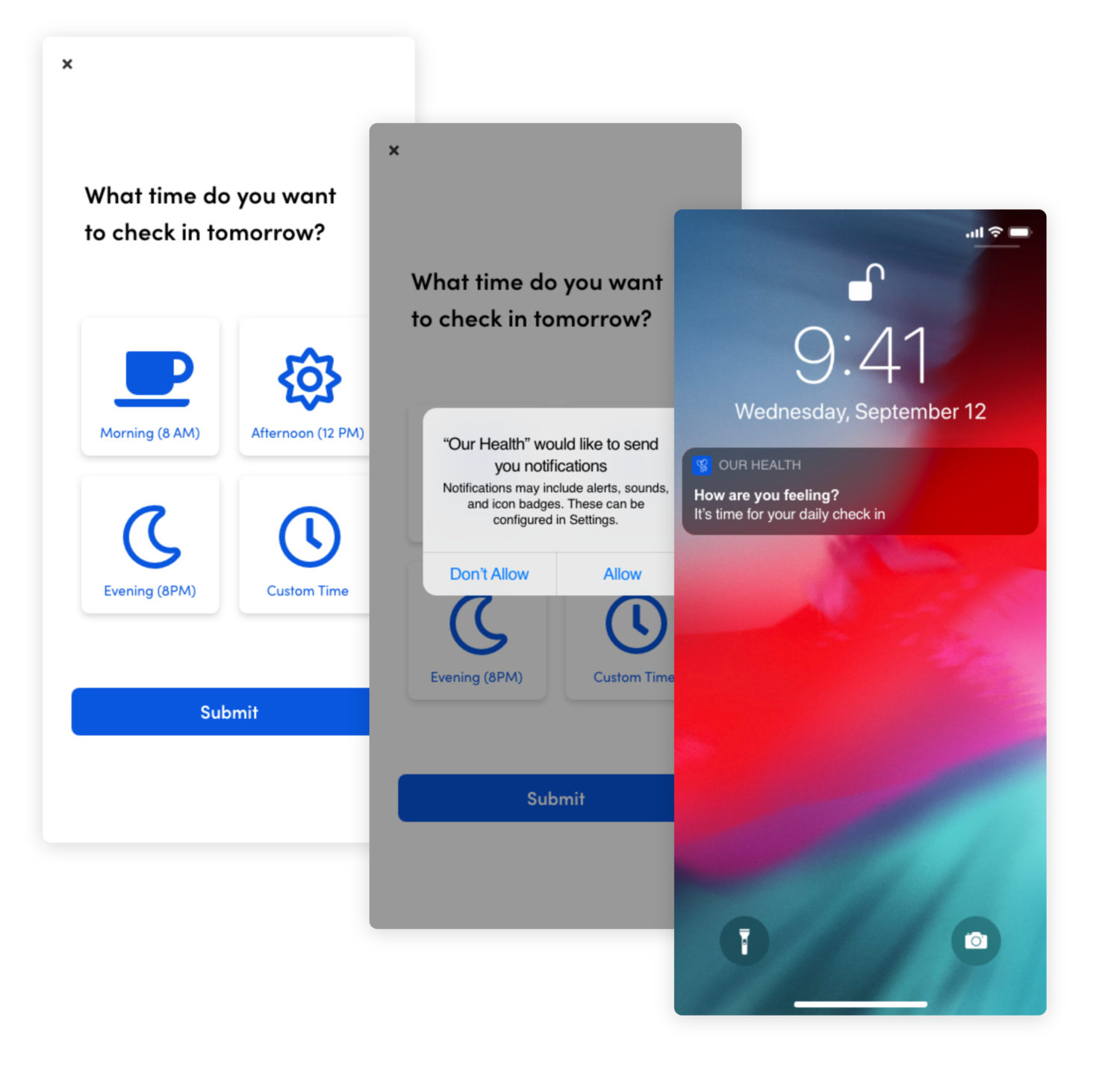
Setting a Reminder
Users can choose a predetermined time, or custom time to be reminded to fill out the assessment. Once a time is selected, a permission popover is displayed.
Everyday at the selected time, OurHealth will send a notification to the user that will display on their lock screen to remind them to check in. Users can edit this reminder at any point in the settings.